- Chronology
- Before 1500 BCE
- 1500 BCE to 500 BCE
- 500 BCE to 500 CE
- Sixth to Tenth Century
- Eleventh to Fourteenth Century
- Fifteenth Century
- Sixteenth Century
- Seventeenth Century
- Eighteenth Century
- Nineteenth Century
- Twentieth Century
- Twenty-first Century
- Geographic Area
- Africa
- Caribbean
- Central America
- Central and North Asia
- East Asia
- North America
- Northern Europe
- Oceania/Australia
- South America
- South Asia/South East Asia
- Southern Europe and Mediterranean
- West Asia
- Subject, Genre, Media, Artistic Practice
- Aesthetics
- African American/African Diaspora
- Ancient Egyptian/Near Eastern Art
- Ancient Greek/Roman Art
- Architectural History/Urbanism/Historic Preservation
- Art Education/Pedagogy/Art Therapy
- Art of the Ancient Americas
- Artistic Practice/Creativity
- Asian American/Asian Diaspora
- Ceramics/Metals/Fiber Arts/Glass
- Colonial and Modern Latin America
- Comparative
- Conceptual Art
- Decorative Arts
- Design History
- Digital Media/New Media/Web-Based Media
- Digital Scholarship/History
- Drawings/Prints/Work on Paper/Artistc Practice
- Fiber Arts and Textiles
- Film/Video/Animation
- Folk Art/Vernacular Art
- Genders/Sexualities/Feminisms
- Graphic/Industrial/Object Design
- Indigenous Peoples
- Installation/Environmental Art
- Islamic Art
- Latinx
- Material Culture
- Multimedia/Intermedia
- Museum Practice/Museum Studies/Curatorial Studies/Arts Administration
- Native American/First Nations
- Painting
- Patronage, Art Collecting
- Performance Art/Performance Studies/Public Practice
- Photography
- Politics/Economics
- Queer/Gay Art
- Race/Ethnicity
- Religion/Cosmology/Spirituality
- Sculpture
- Sound Art
- Survey
- Theory/Historiography/Methodology
- Visual Studies
Who knew? Certainly there were documents from the sixteenth century around the publishing house of Christopher Plantin in Antwerp that mentioned payments to artists who added color to intaglio prints. At the same time in Germany, a quite respectable living was made in the print trade by individuals known as Briefmaler, or print colorists, who were included among the depicted professions in Jost Amman’s Book of Trades (Frankfurt, 1568). Not to mention all those surviving woodcuts from the earlier fifteenth-century, which were almost always religious images of Christ and the saints and were almost inevitably colored, especially with vivid red for blood.
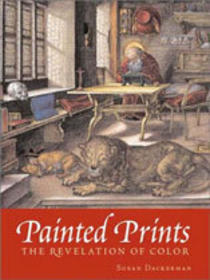
Yet as this groundbreaking exhibition richly demonstrates, such colored prints may well have existed in far greater numbers than we thought. Clearly the print aesthetic, encapsulated, as curator and author Susan Dackerman notes, in the famous Erasmus eulogy (1528) for Albrecht Dürer as an Apelles in black and white, shows that our own appreciation of prints already existed in the formative first century of printmaking, so much so that the addition of color was taken to be an unnecessary artifice that could actually spoil the purity of a print’s virtuoso effects. Dackerman goes on to cite the later portions of the same Erasmus passage to indicate not only this strong view, but also the clear indication that it ran counter to an alternative taste for colored prints, “so that if you should spread on pigments you injure the work” (12).
It seems that we are in a situation akin to the modern expectation of uncolored Greek statues, despite evidence that these too were originally painted, often in what we consider to be garish colors. Visiting Painted Prints: The Revelation of Color in Northern Renaissance and Baroque Engravings, Etchings, and Woodcuts at the Baltimore Museum of Art reveals how difficult it is to shake the modern prejudice for the purity of these “clean” lines of early printmaking. Even the experienced print curators with whom I visited the show could not help speculating that the reason for adding color would be to “cover up” the weaknesses of later, worn impressions of a print.
But this surely cannot have been the principal reason, at least after the middle of the sixteenth century, especially in Germany, where a number of celebrated Briefmaler proudly added their own initials, usually in gold, to the monograms or signatures of the artistic producers of the printed images. Moreover, gold was a frequent accent to the rich palette added to these images, and the colorists were surely well paid for their contributions, essentially as inheritors of the prestigious tradition of illuminations in luxury manuscripts. Often the finest coloration occurred in bound illustrated books. This connection becomes explicit in a set of colored images of Dürer’s Engraved Passion (no. 46), produced between 1508 and 1512 but then later colored by the Nuremberg painter Georg Mack the Elder (act. ca. 1556–1601) and mounted on parchment with consistent marginal ornamentation to simulate the pages of an illuminated manuscript. This particular work adduces other instances observed by previous scholars, chiefly manuscript or drawings specialists. Once more not only has our modern visual prejudice and habits of looking at prints affected our denial of this colored-print phenomenon, but the notable instances of its consideration have also been marginalized from view by being the work of researchers dedicated to studying different media! And scholars of old maps have long noted the presence of original, old coloring, an almost inevitable enhancement of both the beauty and the clarity of their images, often with the same range of pigments. But because map scholarship is so seldom consulted by art historians—who really ought to consider maps as part of their portfolio—these fine observations have gone unheeded. (Dackerman did include a number of large-scale reproductions of maps in the exhibition, chiefly from editions of Abraham Ortelius’s pioneering atlas of 1570, but there were no original maps on view.)
Of course once you start to notice colored prints, they turn out to be less rare than you previously thought. But there is another reason for not having seen many of them together before. Until recently American collections have not sought them out, but the legacy of earlier, princely collections in Europe, particularly in Germany (Veste Coburg is a notable example, duly noted by Charles Talbot in his catalogue for the traveling exhibition, From a Mighty Fortress: Prints, Drawings, and Books in the Age of Luther, 1483–1546 [Detroit Institute of Arts, 1983]). Most of these loans for Painted Prints came from major national museums in Germany and the Netherlands, and the American contributions were acquired within the past decade.
Distinctions within the exhibition sharpened the eye. Some of the earlier prints were colored with stencils, one of which was even recovered for display from a book binding (no. 9), while others were clearly the work of hand-coloring by individual artists. One noteworthy early example is the distinctive modeling in highlights by Hans Burgkmair on his The Virgin and Child under a Round Arch woodcut from 1508 (no. 13), which should be contrasted with the clear stenciling of unsubtle color patches on his St. Veronica with the Sudarium from ca. 1505 (no. 10).
Another of the visual challenges was locating the tiny gold initials of the German Briefmaler who identified themselves on their products. Dackerman’s thorough research turned up quite a few names that ought to become better known now: the Macks of Nuremberg (Hans Mack, Georg the Elder, and Georg the Younger [19–26 nos. 34–39, 42, 46); Johann Bechtholt (no. 43); Domenicus Rottenhammer, the son of painter Hans; (nos. 51–53); and Hans Thomas Fischer (no. 58). Several unknown monogrammists are noted here by their initials (nos. 30, 32, 50).
A final aspect of this exhibition, though not its main purpose, was its consideration of the more esteemed and familiar kind of colored prints, where the pigments formed part of the printing process: “chiaroscuro” prints, pioneered by Hans Burgkmair and Lucas Cranach in 1507–8 (nos. 11–12), then refined by Albrecht Altdorfer in 1519–20 (no. 17), as well as Ugo da Carpi in Italy and later wooduct masters, such as Hendrick Goltzius, in the Low Countries. The experimental colored etchings by Hercules Segers in seventeenth-century Haarlem also make a cameo appearance here (nos. 55–56).
This research was a truly collaborative effort: Dackerman worked with Thomas Primeau, a conservator, to determine the pigments and hence the dates of the coloration (here the comparison to maps could easily have confirmed their own painstaking investigations). Primeau’s own essay in the catalogue discusses both the chemistry of the pigments over time and the x-ray fluorescence and other technology that he used for testing the approximate dates of the coloration. He also notes the different techniques of application, including stencils, illustrated with microscopic details. Dackerman and Primeau’s careful research greatly contributes to both the validity of the phenomenon and the distinction between pigments added close to the time of production and those added later, chiefly in the nineteenth century (several examples on Dürer engravings [nos. 59–60]), where opaque pigments truly obscured the original lines of the print even as they produced an exquisite painted miniature with subtle modeling and rich materials, including gold. In contrast, for the most part, the sixteenth-century additions remained at least partly transparent; this distinction was exemplified by a pair of colored versions of Dürer’s 1519 woodcut of Maximilian I (no. 16, a–b).
When Ted Turner decided in the late 1980s to “colorize” classic black-and-white films such as Casablanca and Citizen Kane for their cable broadcasts, a great outcry arose from film purists about the aesthetic and the fine-grained detail of the originals, which were threatened by the new technology’s additions. Much the same kind of response can be expected on first viewing for these unfamiliar prints. But we must remember that most of the objects on view in Baltimore were colored in the same period as they were produced and that our shock is partly the result of modern prejudice as well as ignorance. Dackerman and Primeau deserve our warm thanks for restoring an entire category of prints to our history of these media and for opening our eyes to the startling and striking qualities of a neglected phenomenon.
Larry Silver
Farquhar Professor of History of Art, Department of the History of Art, University of Pennsylvania