- Chronology
- Before 1500 BCE
- 1500 BCE to 500 BCE
- 500 BCE to 500 CE
- Sixth to Tenth Century
- Eleventh to Fourteenth Century
- Fifteenth Century
- Sixteenth Century
- Seventeenth Century
- Eighteenth Century
- Nineteenth Century
- Twentieth Century
- Twenty-first Century
- Geographic Area
- Africa
- Caribbean
- Central America
- Central and North Asia
- East Asia
- North America
- Northern Europe
- Oceania/Australia
- South America
- South Asia/South East Asia
- Southern Europe and Mediterranean
- West Asia
- Subject, Genre, Media, Artistic Practice
- Aesthetics
- African American/African Diaspora
- Ancient Egyptian/Near Eastern Art
- Ancient Greek/Roman Art
- Architectural History/Urbanism/Historic Preservation
- Art Education/Pedagogy/Art Therapy
- Art of the Ancient Americas
- Artistic Practice/Creativity
- Asian American/Asian Diaspora
- Ceramics/Metals/Fiber Arts/Glass
- Colonial and Modern Latin America
- Comparative
- Conceptual Art
- Decorative Arts
- Design History
- Digital Media/New Media/Web-Based Media
- Digital Scholarship/History
- Drawings/Prints/Work on Paper/Artistc Practice
- Fiber Arts and Textiles
- Film/Video/Animation
- Folk Art/Vernacular Art
- Genders/Sexualities/Feminisms
- Graphic/Industrial/Object Design
- Indigenous Peoples
- Installation/Environmental Art
- Islamic Art
- Latinx
- Material Culture
- Multimedia/Intermedia
- Museum Practice/Museum Studies/Curatorial Studies/Arts Administration
- Native American/First Nations
- Painting
- Patronage, Art Collecting
- Performance Art/Performance Studies/Public Practice
- Photography
- Politics/Economics
- Queer/Gay Art
- Race/Ethnicity
- Religion/Cosmology/Spirituality
- Sculpture
- Sound Art
- Survey
- Theory/Historiography/Methodology
- Visual Studies
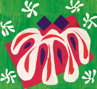
Henri Matisse’s cut-outs, executed during the last twenty years of the artist’s life, have been taken to exemplify the concept of “late style”—the culmination of a career achieved through intensified abstraction, luminosity, and spiritual expression. Yet, as the recent exhibition Henri Matisse: The Cut-Outs at the Museum of Modern Art (MoMA) reveals, the series might be better understood as a continuation of the artist’s lifelong interest in the emotional appeal of color; simplified, synthetic line; and the interplay of decorative surfaces, borders, and frames. Despite repeated references to Matisse’s illness and old age in the exhibition catalogue, documentary photographs, and wall labels—not to mention the black-and-white amateur film showing Matisse sitting in a wheelchair as he cuts sheets of hand-colored paper in his lap—one comes away from the exhibition wondering if his physical state matters. Perhaps his age and disability merely allow the more conceptual and imaginative aspects of Matisse’s artistic process to become visible, as the artist relied on assistants to cover large pieces of paper with gouache, divide them into smaller, easily manipulated sheets, and pin the cut-out shapes to walls or other supports. In the interpretive schema developed by the exhibition, Matisse remains firmly, even masterfully, in control of color choice, the cut contour, layering, and overall design. The film from 1952 shows the artist cutting strange frond and algae shapes out of paper with apparent spontaneity and ease, so much so that I heard numerous visitors dismissively declare, “I guess anything goes.” Yet these curved and floppy motifs are riffs on a theme, shapes that the artist knew well through jazz-like repetition and improvisation. In the film, when Matisse repeatedly lifts and shakes a cut sheet with its multiple finger-like tendrils and dangling loops, it is to release these forms into the air, to see how they wave and flap when disengaged from their paper matrix. The artist’s desire to create a sense of movement propelled his hand and commanded the proliferation of simple, brilliantly colored shapes across walls, around corners, and, sometimes, onto the floor.
Not surprisingly, the cut-outs emerged from a process the artist developed while working on the composition of dancing bodies for the Barnes Murals from 1931 to 1932, the related sketches for the Ballets Russes de Monte Carlo production of Rouge et Noir in 1938, and the maquettes for the illustrated book Jazz in 1943 and 1944. By 1946, with The Lyre—a small work comprising a few motifs cut out of blue-colored paper and pasted on two contiguous pieces of beige paper following faint notations in pencil—the artist had elevated the largely hidden, generative phase of his process to a distinctive technique for finished works. By 1948, the walls of Matisse’s bedroom at Villa le Rêve in Vence were covered with what he had begun to call his “decoupages,” in which the biomorphic shapes of leaves, algae, a circus dancer on a ball, a soaring bird, and several snails, flowed across a grid-like ground of layered, colored papers of variable dimensions, sometimes inhabiting the empty space between the sheets, other times serving as the ground for further figuration.
Matisse, of course, was not the first modernist artist to “cut into color.” (See the text Matisse wrote for the book Jazz: “Cutting directly into color reminds me of a sculptor’s carving into stone” (Jazz, Paris: Tériade, 1947, 73–74; in Matisse on Art, trans. Jack D. Flam, New York: Phaidon, 1973, 112.). For precedents, we can look to Pablo Picasso and Georges Braque’s papiers collés of fall 1912, and, a few years later, to Aleksei Kruchenykh and Olga Rozanovà’s tissue paper and fabric cut-outs created for their handmade book, Universal War (1916). Whereas Picasso and Braque preferred to work with cheap, mechanically printed paper—including patterned and faux bois wallpaper, newspaper, popular musical scores, and advertisements—and only occasionally used blue fine art paper or hand-painted paper, Matisse required the modulated surfaces and highly saturated hues produced by brushing gouache onto white wove paper. As the exhibition’s display of these colored sheets makes clear, they functioned as the equivalent of a pure palette, innocent of prior use and cultural signification. They do not register as appropriated or simulated materials (no fake wood grain here), nor even as colored readymades, despite their reliance on an existing line of industrially produced hues and almost rote, serial execution by several assistants. Using unmixed Linel gouache for the most part (and perhaps occasionally, according to one assistant, blending colors), the artist achieved a variety of tones by having the paint diluted with different amounts of water. Sometimes Matisse had already white paper painted white to retain the aesthetic unity of the pigmented surfaces, yet he would also turn the side painted white to face the paper or canvas ground. According to the museum conservators Karl Buchberg, Markus Gross, and Stephan Lohrengel, the range of blue tones—the most important color to Matisse—consists entirely of variations of ultramarine.
Picasso also had cut directly into paper in his Cubist collages and often pinned the resulting shapes to a support, but to less sensuous, painterly, and decorative effect. Like most of Matisse’s cut-outs, Picasso’s earliest papiers collés of November to December 1912 have no conventionally drawn lines; instead, the cut edge functions as drawing, articulating shape and spatial position through the operations of scission and placement. A sharp, clear cut defines the contour of a bottle, pipe, glass, or guitar along one edge, only to lapse into neutral, straight-edged ground on the opposite side. Yet, even along the unshaped side, Picasso made the cut-out read as figure against the larger paper support. When drawing in charcoal returned in the collages of late fall of 1912—to contradict a cut profile, confound the spatial positions of layered papers, or introduce a wayward shadow—it further undermined the stability of figure/ground relations. Picasso and Braque also clearly reveled in the semantic play of popular cultural materials, employing fragmented images and words to evoke the café and concert hall, with their liquors, card games, dice, advertisements, and music.
Matisse’s cut-outs initially seem far more simple, deliberately naive, and devoid of such conceptually inventive gestures. Certainly Matisse’s approach contrasts with Picasso and Braque’s ironic use of cheap wallpaper as a pictorial element, with its reference to the incursion of mechanical processes and simulated materials into the spaces of domestic decoration. As the documentary photographs of Matisse’s various residences show, the cut-outs find their ideal habitat in the large, well-appointed bourgeois interior, complete with ornamental fireplace, bookshelves, upholstered furniture, mirrors, screens, rugs, and tables covered with vases, books, and plants. But most of all, the cut-outs require generous expanses of wall onto which the artist projected the mobile forms of nature, blurring the boundaries of exterior and interior, fantasy and everyday reality.
The colored shapes that exploded across the walls and spilled onto the floors at Villa le Rêve, the Hôtel Régina in Nice, and the Boulevard Montparnasse apartment in Paris, transgressed both literal and depicted borders to create vectors and patterns suggesting contingency and movement. As in much of his earlier work, Matisse celebrated organic forms and their changing modalities, attending especially to wavering leaves, floating algae, bursting stars, circus performers, and acrobatic or swimming bodies. If the cut-outs have a specific characteristic, it may be how the movement of the cut line engenders the momentary appearance of a shape billowing in the wind, suspended in water, thrown into the air, or flying through a charged atmosphere. Even rendering a seated figure with a bent knee, as in the spring 1952 series Blue Nudes, demanded the nearly impossible grafting together of abstracted, overlapping, stretched, and disjunctive body parts, invented for the occasion and attuned to the quadrature of the support. One feels the energy within these inwardly turned nudes whose lineage can be traced to Michelangelo’s Sistine Chapel ignudi; indeed, the Blue Nudes appear too large for the pictorial space they inhabit and seem poised to shatter. Perhaps not surprisingly, Matisse struggled over this series in which the posture of the body responds to and contests the rectilinear format of the canvas support. The astonishing Acrobats, also from the spring and summer of 1952, were displayed in the same room on a wall perpendicular to the Blue Nudes. The proximity of the two series allowed viewers to register something of Matisse’s process in conceiving the quasi-sculptural force of the body in imminent or actual movement. The Acrobats, which were also the result of much study and revision, refuse the large scale and containment of the Blue Nudes. Instead, Matisse unfurled the acrobatic figure in a series of backflips that create a strange equivalence of legs and arms, projections and cavities, as if the striving body could stretch and contort itself into any desired shape. The siren in the upper right section of The Parakeet and the Mermaid (1952), a near cousin of these corporeal hieroglyphs, appears as a gravity-free vector of flight, her hair and fin streaming back in a fluid matrix. Indeed, the frequent lack of a ground line, and the absence or exaggeration of feet, implies Matisse’s rejection of a classicizing, stable relation of the human form to the earth, and of expressive posture to the givens of anatomy.
Matisse’s love of movement and its three-dimensional implications culminates in the beautifully installed Swimming Pool of late summer 1952. The painstaking conservation of this work inspired the exhibition and is documented in a film. Conceived as a maquette for a ceramic frieze, the cut-outs represent divers and swimmers in nine horizontal panels. The blue figures were initially pinned to the sections of a white band whose edges they frequently transgress, and then attached to tan burlap covering the walls. In the display at MoMA, the panels circle the upper walls of a room whose dimensions and apertures replicate the artist’s dining room at the Hôtel Régina, where the work was originally placed. As with many of the cut-outs, the pinned shapes have been remounted and glued down. Much of the beauty and fragile life of these works has thus, perhaps inevitably, been stilled and flattened, a process begun even in Matisse’s lifetime and with his assent. But as the exhibition reveals, the cut-outs still fixed to their ground with pins retain greater material and phenomenal liveliness, conveyed through the flexures and warping of the loosely attached paper, the occasional lifting of an edge, an overall sense of precarity, and the potential for rearrangement.
Matisse’s cut line, like Picasso’s, is deceptively simple, even deliberately de-skilled, but also full of surprises. The ability to make flat blocks of color operate as mobile three-dimensional forms, at times through complex contours that imply interior folds or overlapping limbs, lies at the heart of Matisse’s endeavor. Already in 1948 on the walls of the Villa le Rêve, the cut-outs multiplied in echoing shapes pinned to a layered support composed of quadrants of color. Even at this relatively early date, Matisse understood the limitations inherent in setting flat shapes against a single, unified color plane. Too one-dimensional and decorative, even for Matisse, this structure demanded amplification and intensification, which he achieved through complex layering, the superposition of smaller lozenge, tear, leaf, and seaweed shapes, and, at times, revisions drawn (and/or partly effaced) in charcoal.
Yet the magnetic pull of the “merely” decorative was never remote. It reappears in the drawings and cut-outs for the Dominican Chapel of the Rosary in Vence, where the antinomic principles of Matisse’s cult of pleasure in the body and in nature, and that of Catholic religious piety, came into conflict. The drawings for Saint Dominic and the Virgin Mary, both figures simplified to the point of banality and made to rest calmly on the ground, demonstrate the difficulties Matisse faced in creating convincing modernist religious art. The artist may have been attracted to the idea of seeing his cut-outs displayed in a luminous architectural setting meant for collective viewing, but he was not a member of this community, nor particularly religious. Similarly embarrassing is the use of a cliché, colonialist visual rhetoric in Creole Dancer (1952); its great splash of colored shapes represents a dancer with a vegetal skirt and pineapple head. Large Decoration with Masks, installed in the Hôtel Régina in 1952, features vividly colored flowers interspersed with the slightly varied forms of a generic head. Intended for a ceramic mural, the grid-like organization of motifs devolves into vacant cheerfulness. Although many of the cut-outs were intended to be reproduced in the form of ceramic or silkscreen wall panels, silk scarves, or stained glass, few of these works turned up in the exhibition, with the exception of the artist’s books, Oceania silkscreens, and various vestments and objects Matisse designed for the Chapel at Vence. By focusing almost exclusively on the cut-outs—which is to say, on the generative phase of his designs—MoMA’s exhibition celebrated Matisse as a master of synthetic form, brilliant color, and all-over composition. Matisse’s cut-outs, however, also bring into view the porous threshold between the modernist processes of simplification, abstraction, and repetition, and those that govern the decorative arts. The exhibition thus provided an exemplary occasion to measure the tension between pictorial works that claim our full emotional and intellectual response and those that, remaining quietly part of a harmonious background, demand very little of us.
Christine Poggi
Professor, Department of the History of Art, University of Pennsylvania