- Chronology
- Before 1500 BCE
- 1500 BCE to 500 BCE
- 500 BCE to 500 CE
- Sixth to Tenth Century
- Eleventh to Fourteenth Century
- Fifteenth Century
- Sixteenth Century
- Seventeenth Century
- Eighteenth Century
- Nineteenth Century
- Twentieth Century
- Twenty-first Century
- Geographic Area
- Africa
- Caribbean
- Central America
- Central and North Asia
- East Asia
- North America
- Northern Europe
- Oceania/Australia
- South America
- South Asia/South East Asia
- Southern Europe and Mediterranean
- West Asia
- Subject, Genre, Media, Artistic Practice
- Aesthetics
- African American/African Diaspora
- Ancient Egyptian/Near Eastern Art
- Ancient Greek/Roman Art
- Architectural History/Urbanism/Historic Preservation
- Art Education/Pedagogy/Art Therapy
- Art of the Ancient Americas
- Artistic Practice/Creativity
- Asian American/Asian Diaspora
- Ceramics/Metals/Fiber Arts/Glass
- Colonial and Modern Latin America
- Comparative
- Conceptual Art
- Decorative Arts
- Design History
- Digital Media/New Media/Web-Based Media
- Digital Scholarship/History
- Drawings/Prints/Work on Paper/Artistc Practice
- Fiber Arts and Textiles
- Film/Video/Animation
- Folk Art/Vernacular Art
- Genders/Sexualities/Feminisms
- Graphic/Industrial/Object Design
- Indigenous Peoples
- Installation/Environmental Art
- Islamic Art
- Latinx
- Material Culture
- Multimedia/Intermedia
- Museum Practice/Museum Studies/Curatorial Studies/Arts Administration
- Native American/First Nations
- Painting
- Patronage, Art Collecting
- Performance Art/Performance Studies/Public Practice
- Photography
- Politics/Economics
- Queer/Gay Art
- Race/Ethnicity
- Religion/Cosmology/Spirituality
- Sculpture
- Sound Art
- Survey
- Theory/Historiography/Methodology
- Visual Studies
A gray day is a good day to visit the Clyfford Still Museum in Denver, Colorado. Against the museum’s cast concrete walls, natural lighting, and textured cement surfaces, Still’s paintings give off a luminous glow that recalls the artist’s own statement, “You can turn the lights out. The paintings will carry their own fire” (Clyfford Still, letter to Betty Freeman, December 14, 1960; Betty Freeman Papers, Archives of American Art, Smithsonian Institution).
As a first-generation Abstract Expressionist, Still’s influence has without question helped define the history of abstract painting. The exhibition Red, Yellow, Blue (and Black and White), curated by the museum’s director, Dean Sobel, examines Still as a colorist, and is the museum’s second major exhibition since its opening in November 2011. The Clyfford Still Museum is unique among museums devoted to a single artist because of the near totality of its holdings: it possesses a staggering ninety-four percent of the artist’s work. A curatorial dilemma for this exhibition as well as future exhibitions might be in narrowing down the 2,400 works on canvas and paper within the museum’s vaults. An exhibition on the theme of color seems an obvious choice for a follow-up to the museum’s inaugural exhibition. For Sobel, it is “perhaps the artist’s use of color [that] contributes to a viewer’s experience of a particular painting or drawing the most” (Clyfford Still Museum press release).
No one, it seems, understood the importance of Still’s work more than Still himself. Nearing the end of his life, the artist carefully drafted a will that would dictate all conditions by which a future museum for his artworks would be built. Neither café nor gift shop would be allowed. No art other than his own would ever be shown, and all work would be “retained [in the museum] in perpetuity for exhibition and study” (Clyfford Still will, May 2, 1978; Carroll County Court, Maryland). The ground floor of the museum skirts at least one of these mandates. Centered in the lobby is a small kiosk of items for sale, including postcards, a Still puzzle, and a wide range of art literature. Among the books are David Batchelor’s Chromophobia (London: Reaktion Books, 2000), as well as the celebrated Interactions of Color by Joseph Albers (New Haven: Yale University Press, 1963). There is even a book of trendy Pantone “inspirational” color samples with names such as French Country, Birthday Balloons, and La Dolce Vita. Monographs of Still’s allies in color—Mark Rothko and Barnett Newman as well as contemporary colorists Damien Hirst, Jeff Koons, Gerhard Richter, etc.—present the artist as a historical forebearer of painterly color and provide a context for examining Still’s place in a lineage of colorists.
At the top of the long staircase that leads to the exhibition hangs one of Still’s dramatically posed self-portraits. With a taut mouth and spindly fingers, he appears as a surly overseer, challenging viewers to regard his work without “assistance, titles or allusions” (Clyfford Still, letter to Betty Parsons, December 29, 1949; Betty Freeman Papers, Archives of American Art, Smithsonian Institution). The first few galleries show the artist’s early landscapes and abstract figures, both of which appear earth-stained and dreary. One searches for evidence of the latent colorist in these works that feature Still’s repetition of muted ochers and browns reminiscent of the farmlands of his upbringing.
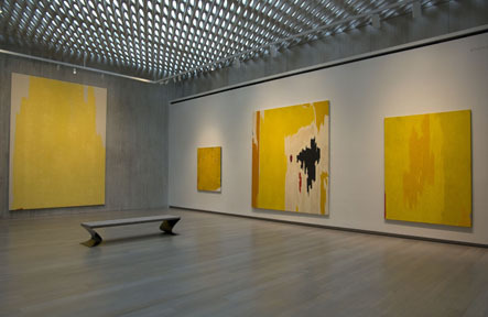
The next three galleries are arranged one primary color at a time—red, yellow, and blue. A black room and a white room follow. For Still, black and white possessed as much chromatic potential as primary colors. Often the terms “painter” and “colorist” are treated as synonyms, yet many painters’ use of color is secondary to other concerns. Still’s use of color eventually became a dominant formal element that, along with texture and image, are meant to “fuse together into a living spirit” (Clyfford Still, quoted in Katherine Kuh, My Love Affair with Modern Art, ed., Avis Berman, New York: Arcade Publishing, 2006, 199).
The works in each room, having been organized by hue, give a heightened emphasis to the color psychology inherent in Still’s work. Individual paintings often test the capacity of a color to dominate a picture’s surface. These were hues meant to saturate the eyes and seep further into realms of the soul.
The first of the galleries devoted to a single color is a dazzling display of Still’s chromatic metaphysics. By the 1950s the artist’s abstractions had evolved into Jungian metaphors of cosmic death and rebirth. In PH–272 (1950) the artist imagines a red universe, an atlas of colliding and separating continents demarcated by colors set adrift in a boiling sea of red. Still’s red is his red, a World War II-era, rubber-infused kind of red, a color not yet influenced by Pop art plasticity. Still’s black resembles Jeep tires melted down and left to elasticize as a scumbled dermis on the canvas surface.
The yellow room contains an example of one of Still’s most extreme compositions. His tendency was to keep shapes and colors out of balance. In PH–893 (1973) a massive vertical canvas shows a flattened contour of a butte-like shape not unlike the stone masses found in Monument Valley. It bears grandeur from color as much as from scale in a way that film director John Ford might have envied. On the bottom left edge of the canvas is a conspicuous red brush mark demonstrating a careful reserve that heightens the dominance of the yellow. The overall monumentality of the central shape is offset by a thin application of paint that blends into a canvas-colored sky. The yellow paintings in this room are never overly repetitious, which is true of his use of color in general. The works selected for this exhibition show how each painting represents a different aspect of a given color. Still’s palette can be imperious, but it is never garish. His earnestness predates the kitschy brass of postmodern hues.
In the blue room is one of the largest works on display. PH–247 (1951) has an epic horizontal format undoubtedly chosen to engulf the viewer’s field of vision. Its dominant tone is some form of luminous ultra ultramarine. The canvas is unequally divided by a vertical black fissure and a thin orange bolt that add frisson to this sublime aquarium, electrifying it with chromatic fury. The painting celebrates blue as a performance, a visual orchestra in which Still’s characteristic jagged shapes dissolve into fathomless blues of Odyssean allure.
By featuring the three colors so often used in Still’s work, the exhibition poses a question about the nature of primary color. The colors are Still’s chromatic building blocks, representing a purity that avoids the manipulation required by the production of secondary and tertiary colors. The expressiveness of red, yellow, and blue in Still’s hands alludes to primal, universal experience as it endeavors to reach the ineffable.
The black room contains one of Still’s most iconic images. 1944–N No. 1 (1944) is one of the painter’s first abstractions and is considered to be one of the earliest examples of abstract expressionism. It functions as an ominous stage on which black serrated curtains close on a grand collaborative finale between artist and nature, a primordial scene of sackcloth-covered skies fractured by magmatic fissures of red, green, and white. Yet this is no annihilative apocalypse, for within Still’s black was the potential for all color—“warm and generative,” unlike Ad Reinhardt’s black monoliths of finality. (The quotation by Still is included on a wall text: “Black was never a color of death and terror for me. I think of it as warm and generative.”)
To analyze Still as a colorist, it is essential to consider color in context. A single-artist museum has the ability to either enhance or play down that context. On the ground floor of the museum, an interactive timeline of twentieth-century art and culture shows the tumultuous world in which Still’s work was produced. Rapidly shifting climates of taste and artistic allegiance were equaled by a rogue sense of creativity. Like other American abstractionists of the 1940s, Still found freedom in color, uninhibited by representation. Color was a means to convey an experience, whether ominous or mystical, beautiful or sublime. Under Sobel’s purview, the museum is designed around Still’s desire for viewers to stand alone before the paintings. Through reflection on Still’s coloring and form, spectators can arrive at their own understandings of the artworks through a catharsis of personal experience.
At the time of his death in 1980, all of Still’s works not previously exhibited were put under lock and key, where they remained for more than thirty years. The newly minted museum exhibits paintings that have the feel of river rocks upturned, revealing lichens of bright color, whose vivacity might shortly diminish if kept in the light. They are paintings that demand contemplation. This sort of “unworthy” reverential musing before “mere” fields of color goes against current trends (particularly in academia). The Clyfford Still Museum asserts itself as a haven for this kind of interaction with the paintings, which feel as alive today as ever before. The paintings are not to be regarded as relics of a bygone era, significant only for their historicity. Each painting is laden with Still’s nonverbal poetics. Indeed, the most important thing the artist said about color is what he refrained from saying. It is left to the viewer to decide whether or not to revel in the siren song of Still’s color.
Drew Williams
independent scholar