- Chronology
- Before 1500 BCE
- 1500 BCE to 500 BCE
- 500 BCE to 500 CE
- Sixth to Tenth Century
- Eleventh to Fourteenth Century
- Fifteenth Century
- Sixteenth Century
- Seventeenth Century
- Eighteenth Century
- Nineteenth Century
- Twentieth Century
- Twenty-first Century
- Geographic Area
- Africa
- Caribbean
- Central America
- Central and North Asia
- East Asia
- North America
- Northern Europe
- Oceania/Australia
- South America
- South Asia/South East Asia
- Southern Europe and Mediterranean
- West Asia
- Subject, Genre, Media, Artistic Practice
- Aesthetics
- African American/African Diaspora
- Ancient Egyptian/Near Eastern Art
- Ancient Greek/Roman Art
- Architectural History/Urbanism/Historic Preservation
- Art Education/Pedagogy/Art Therapy
- Art of the Ancient Americas
- Artistic Practice/Creativity
- Asian American/Asian Diaspora
- Ceramics/Metals/Fiber Arts/Glass
- Colonial and Modern Latin America
- Comparative
- Conceptual Art
- Decorative Arts
- Design History
- Digital Media/New Media/Web-Based Media
- Digital Scholarship/History
- Drawings/Prints/Work on Paper/Artistc Practice
- Fiber Arts and Textiles
- Film/Video/Animation
- Folk Art/Vernacular Art
- Genders/Sexualities/Feminisms
- Graphic/Industrial/Object Design
- Indigenous Peoples
- Installation/Environmental Art
- Islamic Art
- Latinx
- Material Culture
- Multimedia/Intermedia
- Museum Practice/Museum Studies/Curatorial Studies/Arts Administration
- Native American/First Nations
- Painting
- Patronage, Art Collecting
- Performance Art/Performance Studies/Public Practice
- Photography
- Politics/Economics
- Queer/Gay Art
- Race/Ethnicity
- Religion/Cosmology/Spirituality
- Sculpture
- Sound Art
- Survey
- Theory/Historiography/Methodology
- Visual Studies
Among the many pleasures involved in viewing Richard Diebenkorn: The Ocean Park Series at the Orange County Museum of Art (OCMA) in Newport Beach, California, is the fact that this exhibition has come hard on the heels of State of Mind: New California Art circa 1970, a brainy, spirited exhibition that covered roughly the same time period and featured photographs, films and videos, performance documentation, and installation works representing the Conceptual art movement as it appeared in Los Angeles and the San Francisco Bay area. Galleries that had been filled with verbally oriented and often witty works that discarded artistic inheritance are now replete with gorgeous, light-filled paintings of high artistic seriousness that idealize both the formal elements of picture making and the modernist tradition. These are works by a California artist who, at a contemporaneous point in his career, charted his own course and engaged in a single-minded pursuit.
Diebenkorn began in the early 1950s as an abstract painter working in the then-pervasive gestural Abstract Expressionism mode. Around 1957, he transitioned to painterly representational painting, becoming a leading artist in Bay Area Figuration, along with David Park and Elmer Bischoff. In 1966, he accepted an invitation to teach at the University of California, Los Angeles (UCLA). With this relocation, he first moved into a small, windowless studio and then into a large, bright, airy one in the Ocean Park neighborhood of Santa Monica. Within a year, the forty-five-year-old artist transformed himself yet again. Figuration in his art gave way to abstraction in what was to become an extended series of large-scale, geometrically controlled, richly colored (one might even say SoCal colored) paintings belonging to a numbered series he titled Ocean Park. The series, which occupied him for the next twenty years, was to comprise about 145 paintings (most of them monumental in scale, averaging 8 feet high and 7 feet wide) and approximately 500 drawings, collages, and paintings on paper as well as related prints. The last painting of the series was executed in 1985; smaller works on paper continued until he and his wife, Phyllis, moved to Healdsburg in Northern California in 1988.
While well over a dozen exhibitions have been devoted to the Ocean Park series since the year of their earliest group presentation at the Poindexter Gallery in New York in 1968, Richard Diebenkorn: The Ocean Park Series, organized by Sarah C. Bancroft, curator at OCMA, is the first comprehensive exhibition devoted to exploring work from this series in all media—painting, drawing, and graphic art. Organized in collaboration with the Modern Art Museum of Fort Worth, where the exhibition debuted, this is the first major presentation of Diebenkorn’s work since the Whitney Museum of American Art’s retrospective of 1997, curated by Jane Livingston, which gave extensive representation to the Ocean Park series, but included no prints.
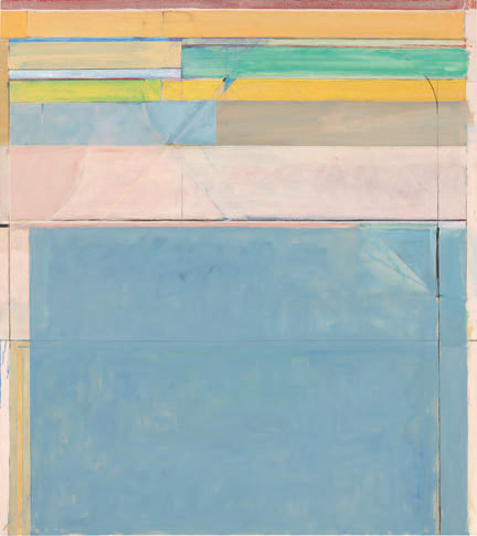
The installation at OCMA is appropriately bright and expansive, with each of the twenty-some-odd large-scale paintings of the series occupying an individual wall. The first two galleries are devoted to early works in which the artist explored a wide variety of compositional formats, some of them preserving what appear to be vestiges of figuration (a window ledge, the edge of a curtain, the bend of a tree) and some employing wide white bands to separate color block areas in a manner reminiscent of stained-glass windows. By 1972, he arrived at a format that was to characterize the Ocean Park series as a whole. This format consists of thin black lines and colored lines and bands that gird large-scale, vertical paintings along the top and sides (although one side generally predominates), providing a kind of architectural scaffold or frame for a thinly brushed, but layered, often subtly subdivided field. Diagonal lines and planes within the border or the open expanse generate recessions into depth. The color combinations within this compositional matrix are unpredictable and highly eccentric, with pastels and primaries often jarringly juxtaposed and with colors laid over one another in such a way as to produce unnamable hues. This essential format is played out in innumerable permutations in the Ocean Park series through variations in composition, color, and handling. The combined influence of a triad of modernists—Paul Cézanne, Henri Matisse, and Piet Mondrian—has long been understood to permeate these paintings; Susan Landauer gives extensive consideration to Diebenkorn’s debt to Cézanne in her essay in the exhibition catalogue.
Upon first encounter, the viewer standing before one of the Ocean Park paintings is submerged in decorative beauty, the large, geometrically contained field of atmospheric color inducing a sensation of calm (Matisse’s proverbial “armchair”). Tension mounts with continued viewing, as the viewer becomes aware of the painting’s complexity, noticing the effects of transparency, overlap, and juxtaposition, along with the spatial dynamics and the seemingly endless erasures and revisions of the picture surface, evidenced by pentimenti. Painting for Diebenkorn involving a search for “rightness,” which, as Livingston explained, was for him “a kind of moral imperative” (Jane Livingston, The Art of Richard Diebenkorn, New York: Whitney Museum of American Art, 1997, 18). It appears to have been an attempt to solve certain compositional and spatial problems by painting, scraping, reworking, building up layers, and so on, not in order to reach a state of resolution, but of perfect imbalance, what Diebenkorn called “a very exciting kind of stillness,” one filled with possibilities (Sarah C. Bancroft, “A View of Ocean Park,” in Richard Diebenkorn: The Ocean Park Series, 22). His was not the existential angst of the Abstract Expressionists, but an intellectually contained tension expressive of the creative struggle. Diebenkorn said, “I want a painting to be difficult to do. The more obstacles, obstructions, problems—if they don’t overwhelm—the better” (quoted in Livingston, The Art of Richard Diebenkorn, 67).
Although the installation of the Ocean Park paintings at OCMA is roughly chronological, the grouping of works shows great sensitivity to their compositional strategies, palettes, and sensibilities, such that the hanging is itself illuminating. In the third gallery of the exhibition, for example, is the stately trio of Ocean Parks #83, #87, and #90 (1975, 1975, and 1976, respectively). Each features lines and bands in black, white, and strong colors (i.e., red, royal blue, or green) clustered at their top and sides bracketing a cream or mustard-colored expanse. While, for this viewer, all three works offer the suggestion of a portal (with deeply recessed space behind), this impression alternates with one that is wholly contradictory: that the paintings are made up of solid and transparent papers stacked one upon another within a shallow depth. Elsewhere in the exhibition is a gallery installed with Ocean Park #109, #115, #116, and #122 (1978, 1979, 1979, and 1980, respectively), all featuring wide and narrow bands in white and soft, glowing pastel colors, with a minimal or no use of black. Each of these paintings, even those that are extensively reworked, exudes a sense of lightness and ease. Installed on a single wall in yet another gallery is a collection of eight small-scale paintings in oil on the lids of cigar boxes, which the artist executed in 1976 and 1979 and gave as gifts to family members and friends. Many feature the “classic” Ocean Park series format; although as an added (and rare, for Diebenkorn) Pop-related element, the emblems and logos of the found objects show through the paint and function as compositional elements.
Numerous sensitively handled collages consisting of sheets of colored pasted paper are found among Diebenkorn’s drawings, a large selection of which (about twenty-seven in all) is featured in the exhibition. Drawing played an important role in Diebenkorn’s art, which he acknowledged by making a habit of showing works on paper done concurrently with paintings in both museum and gallery exhibitions. About twenty works on paper typically hung on the walls of his studio at any given time. Although he sometimes made use of them to solve problems he encountered in painting, the drawings are typically not preparatory studies, but works of art in and of themselves. While the basic format and coloration of a good number of drawings on view in the exhibition echoed those of the characteristic Ocean Park paintings, the works on paper, as might be expected, tend to be looser in handling, more compositionally diverse, and more experimental than the works on canvas, often indicating directions and concerns that he was never to pursue in painting. Moreover, the drawings tend to be improvisational in nature, having been executed with a directness of expression, and often betray both an aggression and a sensuality not found in the paintings. Whereas the work on canvas is about tensions constrained and controlled, revealing little of the self, the drawings often exude passion.
This is particularly true of the drawings employing heraldic symbols that he began in 1980 around the time his mother fell ill; he stopped painting for the three-year period of her decline (she died in 1984). Diebenkorn’s interest in club and spade forms stemmed from his teenage years when his grandmother gave him a deck of playing cards depicting the Bayeaux Tapestry. Diebenkorn has acknowledged that these shapes held “an emotional charge” for him (quoted in Livingston, The Art of Richard Diebenkorn, 80),1 which is clearly evident, as the drawings employing these symbols are among the most sensitive, spirited, and immediate of his career, featuring an expressive and often allusive use of curving lines and bulging organic forms. The bisected form of the asymmetrical spade that fills the surface of the achingly beautiful gouache and crayon Untitled #19 (1981) elicits an almost visceral response. The drawings employing heraldic imagery not only chronologically overlap the Ocean Park series, but fragments of heraldic forms (most often, a curved, breast-like shape) appear in some of the paintings of the Ocean Park series (chinks in the armor of dispassion, as it were), so that the works utilizing these forms constitute a kind of series within the series.
Clubs and spades made their initial appearance in Diebenkorn’s art in his prints. Together with Roman numerals and Greek crosses, they first appeared in a series of ten black-and-white monotypes of 1975 (four of which are included in the exhibition), whose overall structures offer variations on the characteristic Ocean Park series format. The smudgy, almost palpably layered imagery of these prints, which were executed in sequential fashion, not only record the process of their making but offer a kind of visual metaphor for Diebenkorn’s method of adding and erasing and the resulting palimpsests. Diebenkorn had made his first prints in 1961 at June Wayne’s Tamarind Lithographic Workshop in Los Angeles and shortly thereafter established an ongoing working relationship with Kathan Brown at Crown Point Press in the San Francisco Bay area, where he made both suites and individual prints related to the Ocean Park series between 1977 and 1987. These included the portfolio Nine Drypoints and Etchings (1977) with its spare and often spiky black lines, the portfolio Five Aquatints with Drypoint (1978) with its heavy, fluid black lines and forms, as well as the larger-scale, multicolored prints in a range of processes (aquatint, etching, drypoint, lithography, and woodcut) begun in the early 1980s, which more strongly resemble his paintings on canvas and paper. Within the context of the exhibition, it is most enlightening to see the prints rendered exclusively in black and white. These works reveal that the geometric language of black lines on paper is, as Diebenkorn is said to have called it, “the bones of Ocean Park” (quoted in Bancroft, “A View of Ocean Park,” 27).
The exhibition, then, uncovers the Ocean Park series in all of its aspects, from related portfolios of small-scale prints featuring black, skeletal structures to monumental, fully “fleshed-out” paintings adorned with glorious colors, and from works with straight-line geometries of the utmost impersonality to those laden with emotionally charged personal symbols organic in form. Paradoxically, the Ocean Park series emerges from the exhibition as at once more uniform and more diversified than what might have been previously thought. While the format of a majority of the paintings and works in other media adheres to a generalized, readily identifiable “signature” schema, the variations prove endless and the deviations endlessly fascinating.
Roni Feinstein
independent scholar
1 Diebenkorn’s emotional state at the time of his mother’s decline and death is also reflected in a number of the paintings of 1985 with predominantly black surfaces, such as Ocean Park #135, seen in the exhibition, whose composition, palette, and sense of concealment recall paintings by Jasper Johns such as his Gray Rectangles of 1957.