- Chronology
- Before 1500 BCE
- 1500 BCE to 500 BCE
- 500 BCE to 500 CE
- Sixth to Tenth Century
- Eleventh to Fourteenth Century
- Fifteenth Century
- Sixteenth Century
- Seventeenth Century
- Eighteenth Century
- Nineteenth Century
- Twentieth Century
- Twenty-first Century
- Geographic Area
- Africa
- Caribbean
- Central America
- Central and North Asia
- East Asia
- North America
- Northern Europe
- Oceania/Australia
- South America
- South Asia/South East Asia
- Southern Europe and Mediterranean
- West Asia
- Subject, Genre, Media, Artistic Practice
- Aesthetics
- African American/African Diaspora
- Ancient Egyptian/Near Eastern Art
- Ancient Greek/Roman Art
- Architectural History/Urbanism/Historic Preservation
- Art Education/Pedagogy/Art Therapy
- Art of the Ancient Americas
- Artistic Practice/Creativity
- Asian American/Asian Diaspora
- Ceramics/Metals/Fiber Arts/Glass
- Colonial and Modern Latin America
- Comparative
- Conceptual Art
- Decorative Arts
- Design History
- Digital Media/New Media/Web-Based Media
- Digital Scholarship/History
- Drawings/Prints/Work on Paper/Artistc Practice
- Fiber Arts and Textiles
- Film/Video/Animation
- Folk Art/Vernacular Art
- Genders/Sexualities/Feminisms
- Graphic/Industrial/Object Design
- Indigenous Peoples
- Installation/Environmental Art
- Islamic Art
- Latinx
- Material Culture
- Multimedia/Intermedia
- Museum Practice/Museum Studies/Curatorial Studies/Arts Administration
- Native American/First Nations
- Painting
- Patronage, Art Collecting
- Performance Art/Performance Studies/Public Practice
- Photography
- Politics/Economics
- Queer/Gay Art
- Race/Ethnicity
- Religion/Cosmology/Spirituality
- Sculpture
- Sound Art
- Survey
- Theory/Historiography/Methodology
- Visual Studies
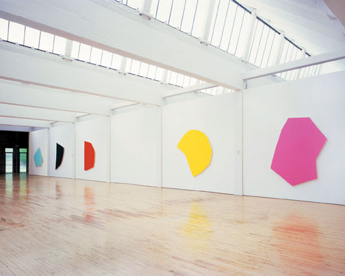
In October of 1977, eight months after the German painter Blinky Palermo’s death at the age of 33, his friend Imi Knoebel exhibited 24 Farben—für Blinky at the Galerie Heiner Friedrich in Cologne, Germany. Knoebel and Palermo met in the 1960s as students of Joseph Beuys at the Kunstakademie Düsseldorf and, like many of Beuys’s students, both went on to exhibit with Friedrich. Friedrich’s eventual patronage of both artists’ careers through the Dia Art Foundation beginning in the 1970s cemented their reputations in the United States and internationally, and, fittingly, Knoebel’s tribute to his friend is now on display for the indefinite future directly adjacent to Palermo’s last works at the foundation’s museum in Beacon, New York.
24 Farben is a suite of twenty-four large, brightly hued monochrome paintings on five-inch-thick pieces of primed wood, each with its own color and idiosyncratic, non-geometric shape. Knoebel personally oversaw the reinstallation, generously spacing the first twenty-one paintings apart from one another to span two of Dia:Beacon’s enormous galleries. Each painting occupies a large stretch of wall that is separated from its neighbors by a thin white support beam running down the wall from a rafter in the ceiling to the floor. The last three paintings stand upright on the floor, the first pressed against the second, the second against the third, and the third against the wall.
The panels of 24 Farben were among Knoebel’s first painterly works, and the suite presents a turning point in Knoebel’s career. His early art, typified by Raum 19 (1968; also exhibited at Dia:Beacon), was sculptural in nature, dealing with the relationship between his wooden objects and the volumetric spaces in which they were exhibited. 24 Farben continues Knoebel’s interest in the sculptural, but, from the late 1970s to the present, he has investigated the properties of the exhibition environment through the conventions of painterly space. Due to the obvious three-dimensionality of their wooden supports, the paintings of 24 Farben take on the character of reliefs, implicating the wall as the structural ground on which paintings solicit the viewer’s gaze. In this way, they anticipate the works for which Knoebel is perhaps most known, produced in the decades after 24 Farben, which attempt to remake the famous abstract paintings of Malevich and Mondrian only to displace their emphasis on the material surface of the canvas by crafting each geometrical element out of painted wood. The faux Maleviches feature trapezoidal panels, mounted diagonally on white walls and arranged as if the wall was the white ground on which Malevich painted. The panels of the faux Mondrians are mounted one on top of the next, each protruding successively from the wall toward the viewer.
In a museum devoted to serial works, 24 Farben stands out. Unlike, for example, a hallway of alternating steel rings and squares by Walter De Maria, or even Bernd and Hilla Bechers’s standardized industrial photographs and Dia’s complete set of Warhol’s shadow paintings, 24 Farben does not offer difference through repetition. Indeed, the bold colors and idiosyncratic shapes in Knoebel’s suite are so unlike each other that one is tempted to experience each painting, except for the final three, as a singular piece. That said, the similarities between the paintings are unmistakable. The colors are rich, mostly bright with a few saturated and dark, and the surface of each displays a matte finish. The sides of the paintings are left untreated, and the exposed “raw” wood of the support, displaying the clean cut of what was likely a jigsaw, provides a striking contrast to the monochrome finish of the painting surface. When viewed head on, the bold colors of the paintings seem to “pop” from the neutral white walls. A slight move to either side, however, reveals the physical distance between the surface of the painting and that of the wall, whose own uniform matte surface rhymes with those of the paintings. Here, the metaphysics of figure on ground and the materiality of painting on wall collapse into one another. Does the painting “pop” in a moment of pure opticality, or does the barely noticeable shadow it casts reveal the painting’s surface to be physically distinct from the wall?
The consonance between the paintings’ even monochrome surfaces and that of the white wall suggests their physical likeness, leading the viewer to imagine a twenty-fifth white painting, carved directly out of the wall only to be mounted as one of Knoebel’s suite. The exposed “raw” wood of the paintings’ supports further indicates, in its divergence from the even finish of the paintings and wall, the similarity between these two classes of sanded and painted wooden surfaces. The last three paintings present a horizontal counterpoint to the vertically stacked objects of Dia:Beacon’s other galleries: Beuys’s gigantic stacks of felt, Robert Smithson’s stacks of glass panes, and, indeed, Knoebel’s own stacks of wood in Raum 19. But 24 Farben’s horizontal stack also draws out the materiality of the installation: the placement of painted wood against painted wood calls the neutrality of the architectural support into question. The boldness of Knoebel’s colors transcends their matte finish; these paintings are as far as one can imagine from the subtlety of Agnes Martin’s muted watercolors or Robert Ryman’s white paintings. The obviousness of Knoebel’s palette—and I mean “obvious” in the most flattering sense—exists in a reciprocal relation to that other, unacknowledged monochrome, Dia:Beacon itself. The viewer thus comes to recognize the white wall behind the painting for what it is: an aesthetic device. 24 Farben’s plenitude of color sensations yields the viewer’s active experience of its inverse: the illusionistically absent support that Yves Klein once named “The Void.”
But to discuss 24 Farben and the works that followed only in terms of their neutralization of the metaphysical space of the painting surface in favor of the phenomenology of physical space is to miss what the suite’s title plainly advertises: twenty-four colors, for Blinky. While the above-stated aesthetic concerns do echo those of Palermo’s wall paintings of the late 1960s and early 1970s, as well as arguably those of Palermo’s late metal paintings, Knoebel’s homage most explicitly commemorates Palermo’s greatest gift: his palette. Palermo’s works, especially the dyed fabrics of his cloth paintings, delighted in the unapologetic juxtaposition of bright, kitschig colors. 24 Farben presents to the viewer a barrage of vibrant colors that, when taken individually, radiate with the intensity of few others in a period when painting was thought dead, killed by Conceptual art. Walking through the suite, however, the twenty-four colors compete and clash, like the mixed-up palette of a child’s crayon box. The viewer is dizzied and left with the memory of no one single color, only of the barrage of heterogeneous sensations. Ochre, hot pink, baby blue, deep purple, light green, fluorescent orange—in an act of celebration and not elegy, Knoebel returned to his departed friend the latter’s artistic gift to the world. But the greater gesture, signaled by 24 Farben’s pivotal position in Knoebel’s oeuvre, is that, more than thirty years on, his work has retained his debt to Palermo.
Godfre Leung
PhD candidate, Graduate Program in Visual and Cultural Studies, University of Rochester