caa.reviews Centennial Project
Lucy Oakley, Editor-in-Chief, caa.reviews (2008–11), Editorial Board (2006–8), and Council of Field Editors (Nineteenth-Century Art: 2004–8)
In celebration of the College Art Association’s 100th birthday, the caa.reviews editorial board presents the top “readers’ picks,” one for each year of publication since the journal’s origin online in September 1998. Each pick is accompanied by a brief description—illuminating the review’s contributions to, influence on, and place in the field—written by current and former members of the editorial board, Council of Field Editors, and editors-in-chief. To identify the most popular reviews, we used statistics from Google Analytics beginning in 2007, when they first became available for the site, through 2010. This enabled us to see the total number of hits on individual reviews over the course of three years. The editorial board chose this quantitative approach to the journal’s history in part to highlight a key difference between caa.reviews and CAA’s other two, print-based journals—we can track closely what our readers read and learn which reviews they are accessing.
Even though this statistical measurement doesn’t allow us to see what readers were choosing before 2007, the Google Analytics list is quite revealing. Earlier reviews have continued to be among the most popular, years after they first appeared online. Despite its early publication date, it did not come as a complete surprise to learn that the review with the most hits by far (almost 7,000) is Quitman Eugene Phillips’s assessment of Timon Screech’s Sex and the Floating World: Erotic Images in Japan, 1700–1820 from February 4, 2000. Holding a distant second place, with about 2,000 hits, is Monica McTigue’s review of several books on Installation art, published on February 6, 2006. Next on the list is Swati Chattopadhyay’s review of Kamil Khan Mumtaz’s Modernity and Tradition: Contemporary Architecture in Pakistan, published in 2001. These selections reveal the journal’s continuity while highlighting the diversity of its coverage across geographic and subject boundaries.
In presenting the caa.reviews Centennial Project, I’d like to thank not only my predecessors as editor-in-chief, Larry Silver and Rick Asher, as well as Sheryl Reiss, my designated successor, but also all past and current editorial-board members, field editors, and CAA staff members whose hard work and dedication to the journal over the years have made its publication possible. Last but not least, we are all deeply grateful to the hundreds of reviewers whose careful readings and lucid analyses have made perusing caa.reviews so richly rewarding, and whose inspired contributions have sparked readers to return for more, again and again.
Happy Birthday, CAA, with many thanks to you, our readers!


1998
Conrad Rudolph, Editorial Board (2010–13) and Council of Field Editors (Medieval Art: 2008– 11)
As part of the Centennial Project celebrating the College Art Association’s 100th anniversary, caa.reviews has thought to highlight “the readers’ choice”—the most often read review— for each year since 1998, the year that caa.reviews was founded. Who would have thought that the most popular review for the first year, 1998, would have been . . . medieval?
And who would have thought that it would have been so polemical? Sculptures stripped of their original polychromy are so familiar to art historians of every period that when, in the course of our normal working day, we mentally visualize sculptures that we know were originally painted, most of us, no doubt, think of them as unpainted. What, then, could be more interesting than Carolyn L. Connor’s The Color of Ivory: Polychromy on Byzantine Ivories, a study whose methodology was, in part, based on the scientific objectivity of the X-ray spectrometry of the scanning electron microscope? What could be more interesting, except a passionate challenge not to the scientific technology but to the general methodology of this study? The main point of contention in this review by Anthony Cutler that is just one step short of a contact sport—Cutler himself describes the broader debate as the “Ivory Wars”—is whether the extant vestiges of polychromy studied by Connor are original or added later.
Do I think that the popularity of this review was because of the fireworks? Actually, no—or at least not mainly. The question of painted sculpture has always intrigued modern art historians, and Cutler accompanies his sharply focused critique with an admirably broad overview of polychromy from antiquity to the early twentieth century, citing material from the period under discussion up through the early twentieth century (with special emphasis on the “rage” of polychromy in the nineteenth century, including reference to a “blockbuster” show on the subject in Berlin in 1884). While my purpose is not to declare for one side or the other in this debate— every reader must decide individually how things stand—one could not ask for a better example of how a review can not only address a new publication in the field or even make the reader more aware of the issues involved but also stimulate further research on the subject. All of this is precisely what caa.reviews was founded for, whether the field of inquiry be modern or medieval.
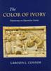
Online readers, and especially those not involved in the “Ivory Wars” clearly set out in the endnotes of The Color of Ivory, should be aware of at least two things before embarking on this review. First, that seven years ago Carolyn Connor wrote an article on traces of color on the Joshua plaques in the Metropolitan Museum of Art,1 interesting because it enlarged greatly on Kurt Weitzmann’s observation in 1930 that their “rosette bands show traces of red and blue color of later date but which surely are [to be considered] modern only with difficulty.”2 Second, that I have already written a short, critical notice of The Color of Ivory3 and agreed to the editors’ request for the present review only because I consider the issue that it raises, and in particular, the manner of argumentation that Connor employs, to be of some concern; neither could be properly discussed within the 190-word limit imposed on the authors of such notices.
The outward appearance of Connor’s book is one of rigorous scientific objectivity. Following an Introduction in which the errors and omissions of previous scholars (including the present author’s) are duly noted, Chapter 1 presents a brief history of her interest in the objects and a description of the “materials and methods” used in their analysis. We are then introduced to the “Database” (printed as Appendix A) of what she calls the “Ivory Project,” a schema in which she classifies the traces of color that she found on 100 pieces in museums from New York to St. Petersburg. Belying Connor’s subtitle, thirty-six of these are Late Antique. To justify their presence, three such objects are included in the fifteen “Case Studies” that occupy the majority of this chapter. Its successor includes the real meat of her thesis: pp. 25–28 represent the reports of two conservators who undertook to analyze the pigments discovered “under the Scanning Electron Microscope by means of energy dispersive X-ray spectometry.” To these results I shall return below. Thereafter comes a chapter on “The Ancient Tradition of Polychrome Ivories,” at the end of which one Late Antique diptych (the Asclepius and Hygieia in Liverpool) is mentioned, and then a chapter devoted to “The Testimony of Ancient and Medieval Texts” (pp. 47–65, where Late Antique and Byzantine discourse makes its appearance on p. 62). Chapter 5 attempts to pull together the significance of all of this for “the Byzantine Aesthetic,” which in Connor’s view, as conveyed by the title of her Conclusion, requires “Shifting the Paradigm.” The book ends with the above-mentioned Database and six serviceable black-and-white drawings noting the location of colors on the Metropolitan’s Joshua plaques.
We are thus returned to the point of departure. But from this moment on Connor engages in a series of misrepresentations and omissions that, whether deliberate or not, serve to magnify her own contribution. Already on the first page, having introduced Weitzmann’s book on the Joshua Roll into the argument, she claims that he “addresses the iconography, inscriptions, and style of both manuscript and ivories but never discusses color.” Of course he did not: in his book on the Roll, Weitzmann referred the reader specifically to his earlier description of the plaques, including the comments on color with which I began this review. And so it goes throughout the book. The Forty Martyrs plaque in Berlin, which today retains only “clear traces of localized” color, is described as “probably cleaned in order to regularize its appearance when the pigment started to flake off.” This is not so. When I examined it before the cleaning in 1987, it was evident that much of the pigment was a later addition; red and blue paint had dropped onto the shoulders and hands of some of the martyrs. As Hans-Georg Severin, then the director of the Skulpturengalerie, realized, and as he made clear in an article that Connor ignores,4 the taste embodied in the painted decoration was utterly at odds with what she calls the Byzantine aesthetic. Similarly, the Metropolitan Museum’s removal of the color from the “Oppenheim casket” (her name for the box with the Deesis, archangels, and apostles), she fails to observe that no polychromy was found under its later lock plate—a clear sign, as Charles T. Little put it, that “the entire casket was never intended to have color.”5 A final example of omission is more embarrassing to report since it involves my own work. Discussing at length the Dumbarton Oaks Emperor plaque and its partner in Gotha, the first of which displays some paint, she remarks that these “are very likely surviving tenth-century examples of the ‘decorated ivory plaques’ awarded officials on the ceremonial occasions of conferring the titles referred to in the Kletorologion of Philotheos.”6 Johanna Flemming had had this insight in 1978 and I, unaware of Flemming’s work, arrived at the same conclusion in 1985.7 I repeated it in 1994, citing Flemming’s article.8 My discussions appeared in books that Connor otherwise cites repeatedly; no reference to any of these readings appears in The Color of Ivory.
But more than academic bad manners affects Connor’s central argument, which begins with the pigment analyses of five pieces (the Joshua plaques, the Forty Martyrs triptych in the Hermitage, and the Metropolitan’s Deesis box) conducted at this last museum’s Department of Objects Conservation. These identify natural ultramarine and lapis lazuli blues,9 natural cinnabar and dry-process vermilion reds, greens from malachite and terre verte, browns and blacks that were mixtures of malachite, terre verte, and cinnabar, and gold foil laid directly on the ivory. Leaning heavily on such cautious phrasing as one conservator’s observation that the use of natural ultramarine “would be consistent with a medieval date,” Connor then elaborates on the history of these pigments, citing texts from the elder Pliny to Cennino Cennini. There is nothing wrong with searching for philological corroboration of an idea, but it would have been more to the point to recall that natural ultramarine was used by Poussin and van Dyck, by Hogarth, and by van Meegeren in his fake Vermeers and Pieter de Hoochs.10 As to dry-process vermilion, Connor tells us that it was “described in a text dating from around 800 B.C.E.,” but surely the proper question is how long it continued to be employed: the answer is certainly as late as Monet’s Water Lilies after 1916. A malachite-based green was identified in Renoir’s Chrysanthemums in Chicago, and terre verte was found in a nineteenth-century collection of artist’s pigments in Stuttgart.
Obviously, none of this requires that all the colors on Late Antique and Byzantine ivories were later additions. But it does mean that the onus of proof is on the investigator who claims that they are original, and this obligation is excluded by definition from chapters devoted to ancient and medieval testimonies. Indeed, nowhere in the book is there even mentioned the rage for polychromy in nineteenth-century Europe. This is not the place to discuss the cult at length. But one might well suppose that someone so concerned with antiquity as Connor is would pay some attention to the famous lecture “Sollen wir unsere Statuen bemalen?” delivered in 1884 by Georg Treu, the excavator of Olympia, and his subsequent Ausstellung farbiger und getönter Bildwerke,a blockbuster show of 330 ancient and modern objects, mounted at the Königliche Nationalgalerie in Berlin in the following year.11 For our present purposes, outstanding among these were creations of Wilhelmine Germany (see nos. 193–266), in which, as in the “copy” of the Athena Parthenos made in 1884 (no. 53), the flesh of the figures was left unpainted while almost everything else was liberally colored. This is precisely the distinction that obtains in Connor’s “reconstructions” of the plaques depicting the Gibeonites before Joshua and the Asclepius and Hygieia (pls. IV, VIII).
In France things went further. Even before the astonishing discovery of the painted terracotta figures at Tanagra in 1873—eventually responsible for Gérôme’s famous canvas, Painting Breathes Life into Sculpture—the sculptor Le Harivet-Durochet discovered that his relief in the chapel of the Immaculate Conception at Sées had been painted at the orders of the clergy. Gérôme’s Tanagra of 1890 was a marble personification in which the lips, eyes, and hair were accented in color, while his chryselephantine statue of Bellona, shown at the Salon of 1893 and at the Royal Academy in London, had head and limbs of tinted ivory carved by the sculptor Moreau-Vauthier.12 All in all, we must take into account what Günter Bandmann called “local and epochal differences” in attitudes toward materials; as he pointed out, well into the nineteenth century, pursuant to the Idealist credo that they were subordinate to artistic form and concetto,—the most expensive materials gold, ivory, precious stones were seen to be enhanced when they were painted.13
Where, then, do Late Antique and Byzantine ivories fit in this enlarged picture? As has long been recognized, presentation diptychs of the fifth and sixth centuries retain traces of color at least some of which may be original. But our understanding of this situation is not helped when Connor tells us that “a large piece of bright orange-red pigment adhered to Asclepius’ robe, while numerous green crystals appeared in the folds of his cloak.” In fact, he wears a single garment and no red appears on his robe in the “reconstruction.” So, too, both he and Hygieia are described in the text as “red-haired,” yet in the plate her hair has the same pallid mauve tint as is visited on her flesh. Connor makes no reference whatsoever to the tabulae ansatae above, and the bases below, these statues, where both Delbrueck and common sense suggest the former presence of painted inscriptions.
Byzantine ivories, on the other hand, may well have displayed far less polychromy than is claimed for them. On the Gibeonite plaque, Connor shows a long inscription all but totally effaced with a dark blue pigment presumably applied by the craftsman who had previously and painstakingly carved it.14 The tenth-century Emperor diptych leaf in Washington, we are told, “proves to have been brightly painted, with a green-stained border over parts of which were substantial remnants of bright blue paint.”15 These traces are still there but the question remains when they were applied. Perhaps because it is not in her database, there is no discussion of the other leaf in Gotha. This has no corresponding polychromy, an absence that strongly suggests the color on the Washington leaf is a later addition. In a generalization, Connor argues that color has been “intentionally removed in the restoration of ivories by owners whose tastes preferred them to be monochrome,”16 adding in an endnote that “[j]udging from the consistency with which similar color traces reappear over and over again in the test group, it is highly unlikely that this was coincidentally the product of many individuals making similar decisions to repaint over a long period of time and in widely diverging circumstances and geographical locations.” To which one can only respond by asking whether it is likely, given this diversity of provenance, that so many objects were so assiduously stripped of their color. Connor has sensitized us to the presence of paint,17 some of which may indeed be vestiges of a pristine state. Beyond the question of repainting, there looms the larger issue of the original extent of this decoration. At present there exists no reason to suppose that most Byzantine ivories were any more extensively colored than those of medieval Islam, the Anglo-Saxon, or the Gothic world.18
Anthony Cutler
Department of Art History, Pennsylvania State University
1 “New Perspectives on Byzantine Ivories,” Gesta 30 (1991), 100–111.
2 Adolf Goldschmidt and Kurt Weitzmann, Die byzantinischen Elfenbeinskulpturen des X.–XIII. Jahrhunderts, I, Kästen (Berlin: Bruno Cassirer, 1930), nos. 1–3.
3 Choice 36, 1, September 1998, no. 36–0086, 109.
4 “Zu drei restaurierten Kunstwerken der Frühchristlich-Byzantinischen Sammlung,” Jahrbuch Preussicher Kulturbesitz 24 (1987), 125–35, esp. 132.
5 The Glory of Byzantium. Art and Culture of the Middle Byzantine Era A.D. 843–1261, eds. Helen C. Evans and William D. Wixom, exh. cat. (New York: Metropolitan Museum of Art, 1997), no. 78.
6 This entire discussion is confused. Connor claims that “it is unclear from the texts whether the tablets, the writing, or the codicils were purple.” Yet the Kletorologion differentiates between “decorated ivory plaques” and inscribed codicils, as Nicolas Oikonomides, Les Listes de préséance byzantines du IXe et Xe siecle, (Paris: CNRS, 1972), 93 n. 41, showed, citing numerous references in the Book of Ceremonies to the presentation either of codicils alone (De cer., 238 lines 11, 15; 239 lines 11–13; 240 line 22 and passim) or of ivory plaques alone (De cer. 248 line 11; 249 line 22; 251 line 4). Moreover, Philotheos, 95 line 11, himself says that the insignia of the anthypatos consist of purple inscribed codicils. It is clear that it is not the diptychs that were “purple dyed” and that the “purple inscribed codicils” were not “plaques made of ivory dyed purple and inscribed” (Connor, 63).
7 Johanna Flemming in Byzantinische Kunstexport, ed. Heinrich L. Nickel (Halle: Martin-Luther-Universität, 1978) 191; Anthony Cutler, The Craft of Ivory. Sources, Techniques and Uses in the Mediterranean World: A.D. 200–1400 (Washington, D.C.: Dumbarton Oaks, 1985), 53.
8 Anthony Cutler, The Hand of the Master. Craftsmanship, Ivory and Society in Byzantium (9th–11th Centuries) (Princeton: Princeton University Press, 1994), 235, 281 n. 35.
9 One would have thought that more relevant than the inlays in this material on the Assyrian ivories from Nimrud that Connor adduces, drawing her information from Richard Barnett, would be the information provided by the Byzantine Book of the Eparch (a 10th-century text and therefore contemporary with many of the ivories in question) about the lapis lazuli (and indigo) brought into the Empire by Muslim merchants. But here, as throughout, the Byzantine evidence is slighted in favor of Ancient Near Eastern and Classical sources.
10 These uses and those cited immediately below depend on a source no more esoteric than the papers by various hands in Artists’ Pigments. A Handbook of their History and Characteristics, II, ed. Ashok Roy (Washington, D.C.: National Gallery of Art , 1993). Natural ultramarine was available to me as a child in my Winsor and Newton’s paint-box.
11 In addition to the catalogue itself (Berlin: Mittler, 1885), a very rare bibliographical item, see the review of the exhibition by G. Schäfer, “Die Ausstellung gefärbter und getönter Bildwerke in Berlin,”Centralblatt für Bauverwaltung 5 (1885), 493. This event was only the climax of a movement that was well under way by mid-century. In 1853 the archaeologist Anselm Feuerbach condemned the rampant polychromy of the time with the words “The venerable grey hair of age is covered up by a blond wig . . . or a spotted fool’s cap.” See The Colour of Sculpture, 1840–1910, exh. cat. ed. Andreas Blühm (Zwolle: Waanders, 1996), 29.
12 Blühm, Colour of Sculpture, 32, 45. See also William R. Johnston, “Later Ivories” in Masterpieces of Ivory from the Walters Art Gallery, ed. Richard H. Randall, Jr. (New York: Hudson Hills, 1985), 284. Again, generally, Moreau-Vauthier and his contemporaries left the fleshy areas unpainted while embellishing hair, clothing, and garments with gold, onyx, malachite, etc. See Masterpieces of Ivory, color pls. 90–93. The only discussion of 19th-century practices in Connor’s book concerns the making of plaster casts.
13 “Der Wandel der Materialbewertung in der Kunsttheorie des 19. Jahrhunderts” in Beiträge zur Theorie der Künste im 19. Jahrhundert, eds. Helmut Koopman and J. Adolf Schmoll gen. Eisenwerth, (Frankfurt: Klostermann, 1971), I, 132.
14 As much is true of the St. Petersburg Forty Martyrs (pl. XII). Connor makes no reference to the fact that someone (the former curator Matsulevich?) removed the paint in this area to reveal the requisite identifying inscription.
15 Connor does not explicitly say that the color is original but this is the clear implication of her text. Other examples of sleight of hand are harder to spot. Thus when she says that “current methods of cleaning ivory may continue to remove traces of their coloration, but these are fortunately being reconsidered,” it is only when the reader turns to the endnote attached to this sentence that he or she realizes that the reference is to a report that argues against the use of certain solvents not on the ground that they remove color, but because they “cause changes in the composition of ivory on the top surface layers.”
16 On the contrary, it is evident that certain collectors preferred their objects colored. It can scarcely be an accident that at least three ivories from the Spitzer collection (the Louvre Nativity Triptych, the Berlin Washing of the Feet, and the Dumbarton Oaks Deposition) display considerable amounts of paint. So, too, it is an interesting coincidence that the two ivories obtained by Henry Walters from Henri Daguerre both display traces of pigment. The study of collectors’ preferences and dealers’ “restorations” is critical to the question of polychromy on ivories; this sort of information is a serious omission from Connor’s “database.”
17 It is noted, for example, on newly discovered ivories and steatites. See Anthony Cutler, “A Byzantine Triptych in Medieval Germany and Its Modern Recovery,” Gesta 37 (1998), 11, n. 31; Clare Brisby, “Colour and Relief on Byzantine Sculpture: The Contribution of an Icon in Steatite,” Apollo no. 144 (December 1996), 54–58.
18 For the state of research, see the papers by Danielle Gaborit-Chopin in Images in Ivory. Precious Objects of the Gothic Age, exh. cat., Detroit Institute of Art, ed. Peter Barnet (Princeton: Princeton University Press, 1997), 47–61 and Paul Williamson and Leslie Webster, “The Coloured Decoration of Anglo-Saxon Ivory Carvings” in Early Medieval Wall Painting and Painted Sculpture in England, eds. Sharon Cather, David Park, and Paul Williamson (Oxford: BAR, 1990), 177–194.


Please send comments about this review to editor.caareviews@collegeart.org.